Graphic design looks like magic when you’re new. You see a poster that feels effortless, a logo that seems obvious in hindsight, or a social post that makes you stop scrolling—and you assume the designer has some mysterious talent you don’t. But graphic design isn’t a secret gift. It’s a skill. And like any skill, it becomes simple once you learn the fundamentals, practice with intention, and build a repeatable process. This beginner guide is your step-by-step roadmap. You’ll learn what graphic design really is, what to learn first, which tools matter, how to practice without getting overwhelmed, and how to create beginner projects that look surprisingly professional. If you’re starting from zero, this will give you structure. If you’ve started and stalled, this will help you restart with momentum.
A: Yes—design is problem-solving and clarity more than drawing talent.
A: Typography and spacing—those two upgrade everything fast.
A: Start with one tool you’ll use daily; many beginners begin with Canva.
A: Most beginners see major improvement in a few weeks of consistent practice.
A: Reduce elements, increase whitespace, and strengthen hierarchy.
A: Not at first—fundamentals matter more than software early on.
A: Social posts, flyers, thumbnails, and simple brand boards are great starters.
A: Use realistic fictional briefs and present them as case studies.
A: Share work with creators or communities and ask specific clarity questions.
A: Chasing tools and trends instead of practicing fundamentals consistently.
Step 1: Understand What Graphic Design Really Is
Graphic design is visual communication. Your job is to make information clear, attractive, and easy to understand at a glance. Sometimes that means persuading someone to click, buy, or sign up. Other times it means helping someone learn, navigate, or trust a brand. The designs can look wildly different—minimal or bold, playful or premium—but the goal stays the same: guide attention and deliver a message.
Beginners often believe design is mostly decoration. In reality, decoration is the smallest part. Great design is decision-making. What should be seen first? What matters second? What can be removed? What tone should this message feel like? If you start thinking like a communicator instead of an artist, your designs improve faster and your work becomes more useful in the real world.
Step 2: Learn the Four Fundamentals That Upgrade Everything
You can learn graphic design faster than you think because most good design is built on a few fundamentals. In 2026, the tools are modern, the trends move quickly, and AI can generate visuals instantly—but fundamentals still decide whether a design feels professional.
Typography is the first fundamental because text is usually the message. If your type is hard to read, nothing else matters. Layout is the second because it controls structure and scanning. Color is the third because it sets tone and creates contrast. Hierarchy is the fourth because it tells the viewer what to look at first and what to ignore.
The best part is that you can improve these skills without expensive software. You can practice them in almost any design tool. Fundamentals are not “nice to have.” They are the actual job.
Step 3: Start With Typography (Because It’s the Fastest Win)
Typography is the quickest way to make your work look “real.” Beginners tend to use too many fonts, too many styles, and too many effects. Professionals keep it simple and intentional. In most designs, one or two font families is enough. What creates variety is size, weight, spacing, and alignment—not adding more fonts.
A beginner-friendly typography approach is to treat text like a system. Choose a headline style, a subheading style, and a body style. Keep your headline bold and clear. Keep body text readable with enough spacing. Make sure your text aligns cleanly to a grid or a consistent margin. When your typography is calm and consistent, the entire design looks more confident.
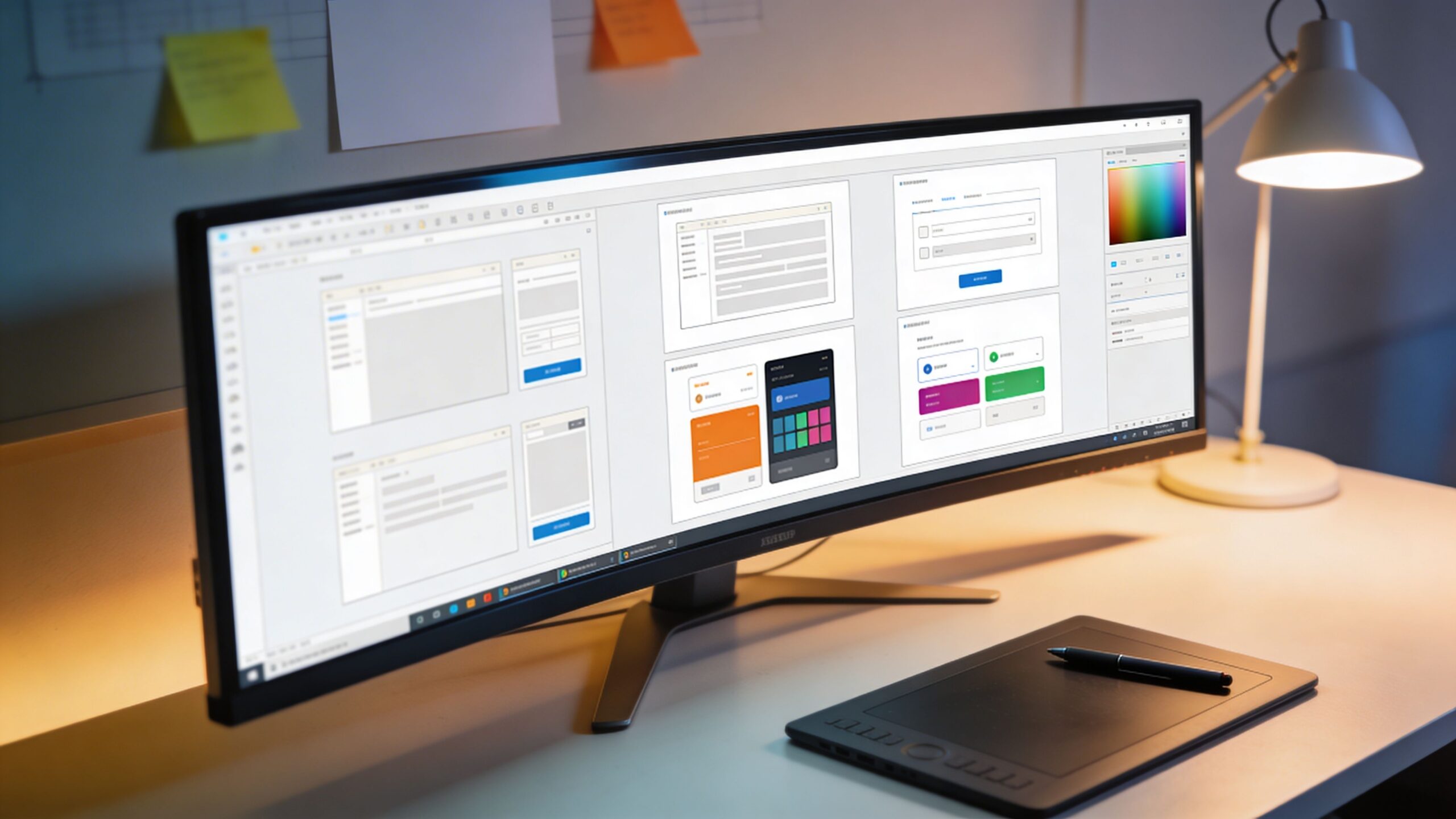
Step 4: Master Layout With Grids and Spacing
Layout is how you arrange elements so the viewer understands them instantly. A clean layout doesn’t need fancy shapes or special effects. It needs structure. The easiest way to build structure is to use a grid, even if it’s an invisible grid in your head. Align text boxes to the same edges. Keep consistent margins. Use spacing as a design tool, not leftover emptiness. A common beginner mistake is filling the canvas because empty space feels “unfinished.” But whitespace is what makes design feel premium. Whitespace gives your message room to breathe. It helps the viewer focus. It makes typography easier to read. If your design feels busy, the fix is often removing elements and increasing spacing, not adding more.
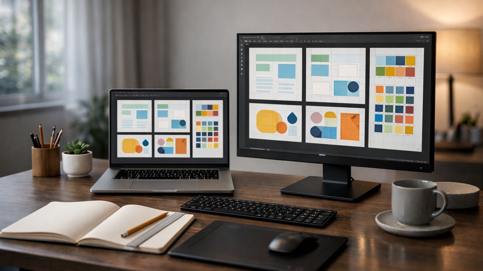
Step 5: Use Color With a Simple System
Color is powerful because it affects emotion instantly. But beginners often treat color like a guessing game. They pick random colors because they look fun, then wonder why the design feels chaotic. Professional designers usually work with a palette, not a rainbow.
A simple palette can be four colors: a primary color, a dark neutral, a light neutral, and one accent. This gives you enough flexibility while keeping your designs consistent. Contrast matters more than “pretty.” If text doesn’t have enough contrast against the background, your design will feel uncomfortable and unreadable. The goal is clarity first, style second.
Step 6: Learn Hierarchy So Your Design Communicates in Two Seconds
Hierarchy is the order in which people notice things. In most designs, people scan, they don’t read. That means you need to control what stands out first. Size is the easiest way to create hierarchy. The headline should clearly be the headline. Contrast is the second tool. Dark text on a light background, or a bright accent on a neutral palette, creates focus. Placement is the third. People naturally notice what’s centered, what’s near the top, and what’s isolated by whitespace. If your design feels “off,” it’s often because everything is competing for attention. When everything is bold, nothing is bold. Choose one hero message and let everything else support it.
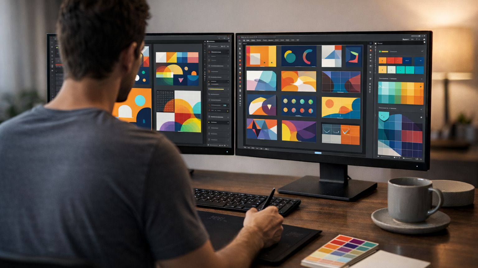
Step 7: Pick Your Starter Tool (And Don’t Overthink It)
You don’t need the “perfect” software to begin. You need a tool you’ll actually use. In 2026, many beginners start with Canva because it’s fast, approachable, and strong for social graphics, flyers, and marketing visuals. If you want deeper control for professional workflows, you may explore more advanced tools over time, especially for vector work and photo editing.
The biggest mistake is switching tools constantly. Tool-hopping feels productive because you’re learning menus, but it doesn’t build design skill. Pick one tool and commit for a few months. Let the tool become familiar so your brain can focus on design decisions instead of button hunting.
Step 8: Learn the Basic File Concepts That Prevent Rookie Mistakes
Graphic design includes a few technical concepts that make your output look professional. Resolution matters. If you design too small, your work looks blurry. If you export incorrectly, text becomes fuzzy. Understanding basic file types also saves you headaches. Some formats are best for crisp graphics, others for photos, others for print-ready output. The beginner goal is not to memorize technical details. The goal is to learn a repeatable export workflow: save your editable source file, then export versions for where the design will live. A design for Instagram is different from a design for a website banner. Knowing the destination before you export protects quality.
Step 9: Practice the Right Way—Small Projects, Big Improvement
Design skills grow fastest through finished work. Not watching more tutorials. Not collecting inspiration. Finished projects. The best beginner practice is short, focused design reps. Choose one type of design and repeat it.
For example, create a series of social posts for a fictional coffee shop. Then create a series for a fitness coach. Then create a series for an online course brand. By repeating the same format across different “clients,” you train your eye for hierarchy, spacing, typography, and color. You also build portfolio pieces naturally.
Another powerful exercise is redesigning. Find a bad flyer, a cluttered menu, or a confusing poster and redesign it with clearer hierarchy and spacing. Redesign projects prove you can improve communication, which is exactly what clients want.
Step 10: Build a Beginner Portfolio That Actually Gets Attention
A portfolio is not a gallery of random designs. It’s proof you can solve problems visually. Even as a beginner, you can create “case studies” by explaining what the design needed to do and how you approached it.
Instead of posting one logo, show the logo used on a profile icon, a banner, and a simple mockup. Instead of one social post, show a small campaign set that looks consistent. Instead of one flyer, show two variations and explain why the final one is clearer. The fastest way to stand out is to show consistency. Beginners often show variety, but professionals look for coherence. A small set of strong, consistent work beats a large set of scattered experiments.
Step 11: Learn Feedback Without Losing Confidence
Feedback is part of design. In the real world, you’ll revise work constantly. Beginners often take feedback personally because they feel like the design is “them.” Professional designers treat feedback as input on the work, not a judgment of their talent. A good habit is asking for specific feedback. Instead of “Do you like it?” ask “Is the headline easy to read on mobile?” or “Do you know what this graphic is about in three seconds?” Clear questions produce useful answers. Useful answers help you improve quickly.
Step 12: Your First “Designer Workflow” You Can Repeat
If you want a simple process that works for almost any beginner design, follow this sequence. First, write the message in plain words. Second, choose one strong visual anchor: a photo, icon, or shape. Third, create hierarchy with a headline, a supporting line, and maybe one call-to-action. Fourth, align elements cleanly with consistent spacing. Fifth, limit fonts and colors. Sixth, export for the platform.
This process removes the feeling of staring at a blank canvas. It gives you steps. And with repetition, those steps become instinct.
Step 13: What to Learn Next After You Have the Basics
Once you can make clean, readable designs consistently, you’ll naturally want to expand. Many designers add brand identity systems, logo design, packaging basics, and simple motion graphics. Others move toward UI design or marketing design specialization. The key is choosing your next skill based on the projects you want to do, not based on what feels trendy. In 2026, designers who combine strong fundamentals with speed and consistency have a huge advantage. If you can produce professional-looking work quickly, you become valuable to businesses and clients even before you feel “expert.”
Final Thoughts: Becoming a Designer Is a Momentum Game
Graphic design is not a single breakthrough moment. It’s a stack of small improvements. You learn one rule, you practice it, and suddenly your work looks better. You learn another, and it gets better again. The biggest difference between people who become designers and people who quit is consistency.
Start with typography and spacing. Finish small projects. Build a mini portfolio. Get feedback. Repeat. If you do that, you won’t just “learn design.” You’ll become a graphic designer—one finished project at a time.