Canva is the reason a lot of people have a “designer moment” for the first time. You open a blank canvas, drop in a photo, add a headline, and suddenly you have something that looks polished enough to publish. That feeling matters. It turns creative anxiety into momentum, and momentum is how skills are built. In 2026, Canva isn’t just a beginner tool anymore—it’s a full creative workflow for entrepreneurs, students, educators, content creators, marketers, and even teams who need high-quality design on tight timelines. This guide is built for people who want real results without feeling overwhelmed. You’ll learn how Canva works, how to design graphics that look professional, and how to create consistent visuals across social posts, presentations, flyers, thumbnails, and more. You don’t need a design degree. You need a system you can repeat.
A: Yes—Canva plus basic design rules gets you strong results fast.
A: Layout hierarchy and spacing—those two upgrade everything.
A: Change fonts, colors, spacing, and imagery to match your brand.
A: Start with platform presets, then export for each channel.
A: Usually no—use fewer elements with stronger hierarchy.
A: PNG for crisp graphics; JPG for photo-heavy images.
A: Save a palette and fonts, then reuse layouts across posts.
A: Yes for many small brands, especially digital assets and content.
A: Not to start, but Pro helps with brand tools and faster workflow features.
A: Recreate designs you like, then remix them into your own style.
What Canva Actually Is (And Why It’s So Powerful)
Canva is a browser-based and app-based design platform that combines templates, drag-and-drop editing, and an expanding library of assets into a single workspace. The magic is that it removes friction. Instead of wrestling with complicated menus, you’re focused on choices that matter: layout, typography, color, and imagery. It’s like having a design studio where the tools are already laid out and labeled, and you can start creating before you feel “ready.”
In 2026, Canva’s best feature isn’t one button or effect. It’s speed. Canva helps you go from idea to finished graphic in minutes, and that speed is what allows you to iterate. When you can create quickly, you can test styles, explore variations, and learn what works for your audience. That is how beginners become confident.
The Difference Between “Nice” Canva Designs and “Pro” Canva Designs
Most Canva designs look “fine,” and that’s where many people stop. But the gap between fine and professional is not expensive software—it’s design decisions. Professional-looking Canva graphics usually share the same invisible traits: clear hierarchy, intentional spacing, readable typography, consistent color, and a strong focal point. Beginners tend to fill the canvas. Professionals leave breathing room. Beginners use too many fonts. Professionals commit to one or two. Beginners chase trends with random elements. Professionals build a repeatable visual language. Canva makes the creation easy, but the mastery comes from learning a few core principles and applying them consistently.
Start With Purpose: One Graphic, One Job
Before you touch templates, decide what the graphic is supposed to do. Is it meant to stop a scroll, explain a concept, announce an event, sell a product, or build brand trust over time? When you know the job, your design choices get simpler. A promotional graphic needs clarity and urgency. An educational graphic needs readability and structure. A brand graphic needs consistency and tone.
A common beginner mistake is designing without a goal, which leads to designs that feel busy or uncertain. A simple question fixes it: “What do I want the viewer to do or feel in the first two seconds?” Your answer becomes your design filter.
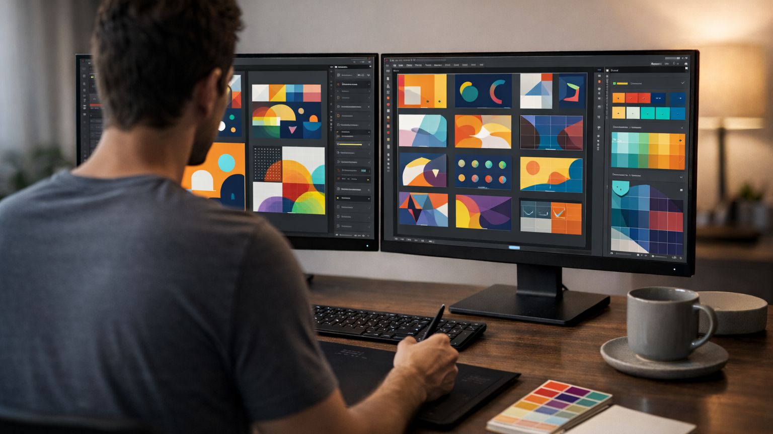
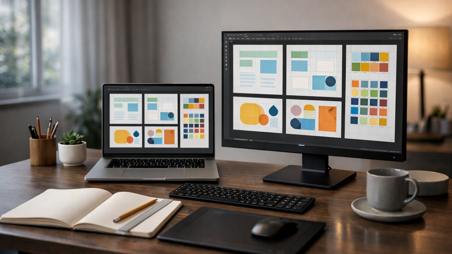
Templates Are Training Wheels—Use Them Like a Pro
Templates are one of Canva’s biggest advantages, but the key is treating them as starting points, not finished products. When you open a template, you’re borrowing a layout structure and typography system that already works. Your job is to adapt it so it matches your message and style. A pro move is to choose a template style you can reuse. If you want a consistent look across a content series, find three to five templates that feel like they belong together. Then customize them with your colors, your fonts, and your imagery. Over time, those templates become “your brand,” even if you started with Canva’s foundation.
The Canva Layout Formula That Works Almost Every Time
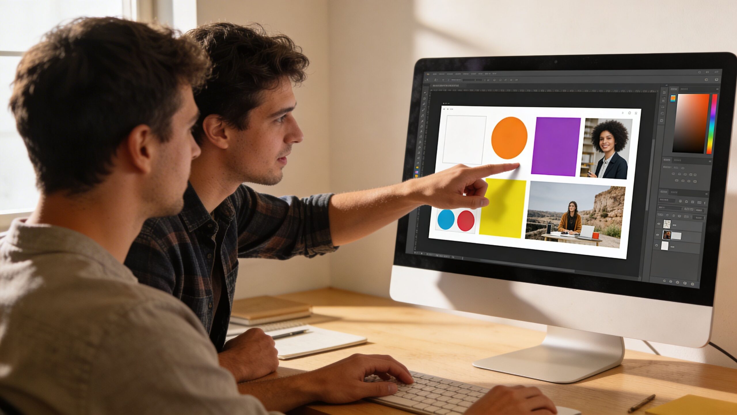
If you only learn one design habit, learn this: build around a clear hierarchy. A great Canva design usually has a headline, a supporting line, and a visual anchor. The headline carries the main message. The supporting line provides context. The visual anchor pulls attention and sets the tone, often through a photo, shape, or illustration.
When your design has too many equally loud elements, the viewer doesn’t know where to look. In Canva, this happens when people use multiple stickers, multiple text blocks, and multiple competing colors. The solution is not more decoration. The solution is picking one “hero” element and letting everything else support it.
Typography in Canva: The Fastest Way to Look More Professional
Typography is where beginners accidentally give themselves away. The good news is that you don’t need to be a typography expert—you just need a few reliable rules. First, limit fonts. Two fonts is plenty: one for headings, one for body text. Second, increase contrast in size. Small differences look like mistakes; big differences look intentional. Third, align your text cleanly. Mixed alignment can work, but beginners often do it randomly, which feels chaotic. Canva’s font combinations can help, but your best results come from consistency. Pick a font set for your brand and use it repeatedly. Over time, your audience starts recognizing your content before they even read it.
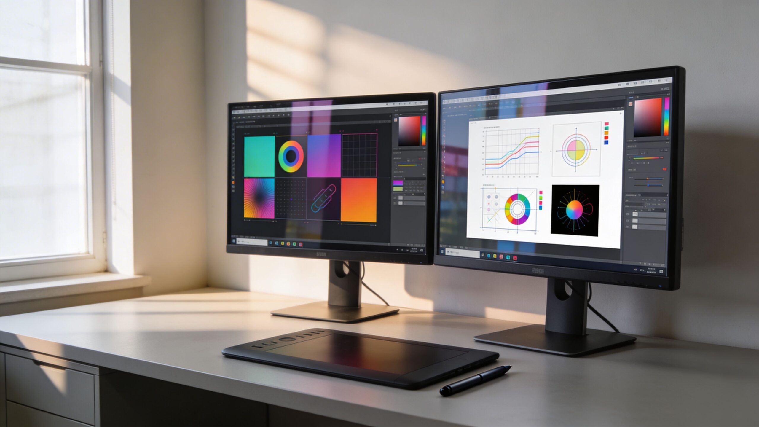
Color in Canva: Stop Guessing, Start Systemizing
Color is emotional, and Canva makes it tempting to experiment endlessly. But consistent color is what makes your designs look professional. Instead of choosing colors from scratch each time, build a small palette: one main color, one dark neutral, one light neutral, and one accent color. This gives you range without chaos.
If you already have a brand, match your colors to your existing identity. If you don’t, choose a palette that reflects the mood you want: calm and modern, bold and energetic, premium and minimal. Canva’s palette tools make it easy to save colors so you aren’t reinventing your visual identity for every post.
Images and Backgrounds: The Make-or-Break Element
In Canva, images are often the difference between “template-looking” and “studio-looking.” A strong image can do half the design work for you. The trick is choosing images with clean composition and enough negative space for text. When people use busy photos, they end up adding overlays, shadows, and effects to force readability. That’s not wrong, but it’s harder. A better approach is selecting images that naturally support your layout. Look for photos with clear focal points and simple backgrounds. Use cropping intentionally so your subject sits where the eye expects it, and keep your text away from visual noise.
Mastering Spacing and Alignment: The Hidden Skill
Canva’s alignment guides are your best friend. Great design often looks “easy,” but it’s usually precise. Clean spacing is what makes your design feel calm and confident. A fast way to improve is to align elements to invisible lines and keep consistent margins.
Instead of nudging text until it feels “about right,” use Canva’s position tools. Center things deliberately, align edges, distribute spacing evenly, and keep blocks of content grouped. When your spacing is consistent, your design looks intentional—even if the template started simple.
Canva Brand Kit and Consistency: Your Shortcut to a Signature Style
If you create content regularly, consistency is your advantage. Canva’s Brand Kit features help you lock in fonts, colors, and logos so every design starts with your visual identity. Even without logos, consistency in type and color builds recognition. A signature Canva style is not about being fancy. It’s about being repeatable. When you can create a “look” you can reproduce quickly, you stop wasting time starting from zero. Your workflow becomes faster, and your output becomes more cohesive.
Canva for Social Media: Designing for the Scroll
Social graphics succeed when they’re readable in motion. People don’t carefully study posts; they glance. Your headline needs to be legible at phone size. Your contrast needs to be clear. Your layout needs to guide the eye instantly.
Design for one message per post. If you want to teach something, build a carousel series where each slide has one idea. Canva makes this easy, and it’s one of the best ways to grow skills because each slide becomes practice in hierarchy and simplicity.
Canva for Presentations: The “Easy Win” Most People Ignore
Canva presentations can look surprisingly premium when you use consistent layout rules. The biggest mistake people make in slides is stuffing too much information onto one screen. Presentations work when each slide supports the speaker, not replaces the speaker. In Canva, choose a presentation theme and commit. Keep the same header style, the same spacing, and the same accent color. Use imagery sparingly and cleanly. The goal is clarity, not decoration. When you do this, your presentations look like they were built by a professional team, even if you’re working solo.
Canva Exports: The Setting That Protects Your Quality
A design can look perfect in Canva and blurry everywhere else if you export incorrectly. Quality depends on the platform. For online graphics, use high-quality PNG when clarity matters. For photos or large image-heavy designs, JPG can work. For print-ready materials, PDF options often make the most sense because they preserve crisp text and vectors.
The best habit is to decide where the design will live before you export. A YouTube thumbnail is different from a flyer. A website banner is different from an Instagram Story. Canva makes exporting simple, but intentional exporting is what keeps your work looking sharp.
Canva’s AI Tools: Helpful, Not Magical
In 2026, Canva’s AI-driven features can speed up design decisions, suggest layouts, remove backgrounds, and generate variations. These tools are powerful, but the best results still come from your taste and clarity of purpose. AI can propose options, but you choose what fits your audience and your brand. Think of Canva’s AI features as a creative assistant. They help you move faster, but they don’t replace the fundamentals. The better your design judgment, the more valuable AI becomes.
A Real Beginner Path: From Zero to “This Looks Legit”
If you’re truly new, start with one format you’ll use often. Social posts are a good training ground because the canvas is small and feedback is immediate. Make ten designs using a consistent template style. Then make ten more where you change only one variable, like typography or color. This controlled repetition teaches your brain what works.
Next, build a mini “brand system” for yourself. Choose a palette, choose two fonts, and create a small set of reusable layouts. When you do this, your work begins to look cohesive, and people start trusting your visuals.
Final Thoughts: Canva Mastery Is About Repeatable Confidence
Canva is not just for beginners, but it is perfect for beginners because it gives you early wins. Those wins matter. They turn fear into practice. The real mastery comes when you stop designing randomly and start designing systematically. When you can build clean hierarchy, consistent type, intentional color, and balanced spacing, your Canva designs stop looking like templates and start looking like your brand. You don’t need experience to design stunning graphics. You need a process you can repeat. Canva gives you the tools. Your consistency gives you the results.